I’m sure Good Magazine has good intentions. They stand for good causes. They care deeply about some of the most important issues of this century. I also think the design of the magazine is very attractive, like a beautiful Apple product. But, much like it is with Apple, there’s a trap. When you try very hard to look good, you can end up being elitist and self-absorbed. Readers or web users end up with a message that prefers form over function instead of trying to create a synergy between them.
The reason this upsets me is that this magazine has a department called Transparency, which is supposed to show “graphical explorations of the data that surrounds us.” The intention is defenitly good. I think it is very important to visually explore and display data. You gain insights that are practically impossible to achieve in numbers or text alone. A good info graphic takes complex data and makes the big picture clearly visible. Think of the hockey stick chart of global warming, or the classic graphic of Napoleon’s march to Moscow and back, which tells a story in an instant, that would otherwise take a few dense pages of data and text to explain. Unfortunately, the reality is different for most of the visuals Good and its collaborating designers put on display under this department.
In my opinion Good’s data visualizations suffer from three main problems:
- Low information density
- Irrelevant or misleading comparisons and scales
- Form over function, medium over message
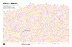
Low information density: Making data bigger doesn’t make it clearer or more important. You can use one paragraph or bulleted list for some graphics that Good spreads out over a couple of printed pages. The following graphic is an attempt to show how much storage space is available for rent in the US. Is this supposed to be more impressive because it takes up two pages? How about showing the reader what it is per person, and how that compares to other countries, or other times in this country? As is, this visual is the equivalent of displaying numbers in very large type size, and nothing beyond.
Irrelevant or misleading comparisons and scales: How many chopsticks would you have to line up to reach the full length of the Great Wall of China? More importantly, why would you want to do that? The good people at Good and the designers who collaborate with them spend the time and space alloted to them by the reader in pursuit of such pertinent questions. Moreover, even if the comparison makes some sense, the visuals do not allow the reader to make the comparison visually. Based on the packaging peanut diagram above, try to estimate how much space is used for commercial versus personal storage in the US. The visual gives us very little value in return for our undivided attention.
Form over Function: The third problem is what Edward Tufte calls “chart junk.” Now, I’m not as smart as Tufte, and maybe that’s why I’m not completely against attractive looking charts, or even funny and decorative ones. It does make the data more engaging, as long as we do not forget that the basic purpose of the visual is to effectively deliver the overarching pattern. When the decorations and style begin to obscure the message, that’s when we have a bad visual.
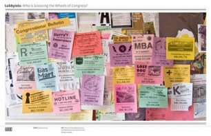
Now let’s take a look at a typical example of the visual explorations you might find in Good:
What is this telling us? What’s the important bit? Can you see any pattern here? This visual is supposed to make us smarter about the various interest groups who are lobbying Congress for different things. Attracting attention to an issue is important, but couldn’t this double page spread be used more effectively?
It’s not that this graphic isn’t fun to look at. It’s that it’s only fun to look at, and nothing beyond. A dumb supermodel.
My point is this: when you get a chance to communicate with a large audience, over a double spread in a magazine that’s read by thousands of intelligent and motivated people, don’t squander it on style alone. Make style the vehicle to carry substance effectively beyond people’s usual media fatigue.
Don’t just look good. Be good.


