Challenge
The community in Hunts Point – the poorest zip code east of the Mississippi River – knows about being dealt a tough hand. The impoverished individuals of Hunts Point needed a leader to help them see that a brighter tomorrow is within their grasp. The Hunts Point Alliance for Children (HPAC) had been steadily gaining ground within the community for years, but now wanted to show that their dedication to bettering Hunts Point was deep, serious and “ready for prime time”. How could they communicate with kids, adults, donors and other local nonprofits all at once while maintaining razor-sharp focus?
Solution
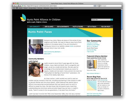
First we took pictures – hundreds of them. Since HPAC acts as a resource center for more than 10 different services, showing the common denominator – improving the lot of the children of Hunts Point – absolutely had to be shown in photographs first. HPAC deals in complexity, so the golden road to the interest of the public needed to be reflected in the faces of the kids as opposed to heavy text and charts.
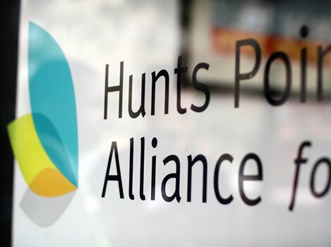
Together with this, defining their visual identity to speak a common language was the path to communicating their effect. While maintaining the color scheme of their old logo, which had held some weight within the community, Empax simplified what was once a complicated, busy, all-inclusive logo to something more abstract, airy and inspiring. The transformative nature of HPAC’s new visual identity has proven transcendent for the organization.
Impact
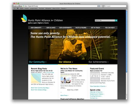
The HPAC message of getting things done in an inspired way has been spread across the web, print materials, merchandise, storefronts and employee workspaces. This all-encompassing approach to adopting a refreshed identity has helped unite and strengthen the force of HPAC’s work from the inside out. Their new website offers a place for all their stakeholders to feel connected and engaged, and to witness the remarkable change that is that HPAC has helped to bring about.