
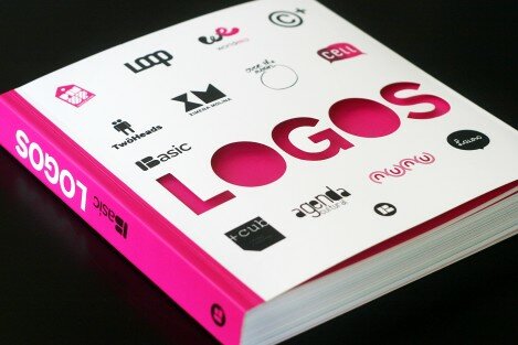
Index Book, a Spain-based company that creates books relevant to the design world, has released its first-ever Basic Logos book. This Book of Inspiration compiles logos from designers around the world, showcasing the basic disciplines of graphics, typography and illustration. The wide range of style and aesthetic give readers a unique sense of the visual world and help educate us all about trends in the design world. Empax was delighted to learn we had not one but TWO of our recent client logos selected for inclusion; for Matan and for the Gotham Awards.
So why is this so exciting to the team at Empax? (Other than the fact that it’s a nice feather in our cap to be recognized by such a highly sought after design book company.) It promotes our clients. The opportunity for our clients new logos to appear in an internationally sold book increases their visibility, plain and simple.
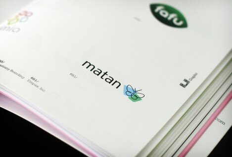
Matan is a New York City-based nonprofit focused on providing education to special needs children in the Jewish community. When Matan came to Empax, they were ready to move from being a regional organization to one with national reach, and they knew they needed a new brand to reflect this transition. The brand and logo work that Empax executed for Matan had incredibly reach both internally and externally for Matan. The butterfly is a new and unexpected meme in the world of Jewish education and pedagogic approach. Matan’s new identity has energized the organization’s employees and helped them communicate their expanded and liberated focus to new stakeholders.
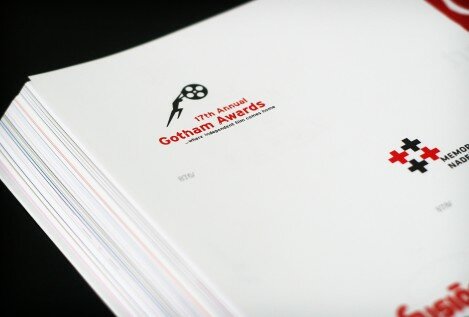
Creating a refreshed brand for 17th Annual Gotham Awards was a task that came to Empax with a specific timeline: 10 days. We were charged with reviving the Independent Film Project’s logo for the Awards, while maintaining the recognition and equity that already existed. We injected life into the brand by streamlining and adding action to the IFP’s iconic character, Sisyphus, and replaced the old typeface with a custom “distressed” type, to symbolize urban grittiness. The IFP brand is now integrated into the organization’s character and the Gotham Awards ceremony was a great success.
So, here’s a toast to not just Empax, but our clients too. Without their hard and dedicated work, we wouldn’t have the opportunity to create impactful brands. And we certainly wouldn’t end up in books.
Thank you! That looks like a great resource
Yes – it is a great resource. Another book worth investing in is Designing for the Greater Good (http://www.designingforthegreatergood.com/) which also features the Matan logo that Empax created.